


More visitors will not solve every website problem. If people cannot understand what you offer, find the right service, or complete the contact process, a larger audience may simply encounter the same obstacles.
Before expanding a campaign, review the route from arrival to a useful inquiry. You do not need a complete redesign to begin. A few well-chosen improvements can make the existing website easier to understand and easier to maintain.
Start with one real task
Choose a task that matters to the business: find a particular service, check an important requirement, request a quote, book a visit, or buy an item. Begin on the page a customer would actually reach, not automatically the homepage.
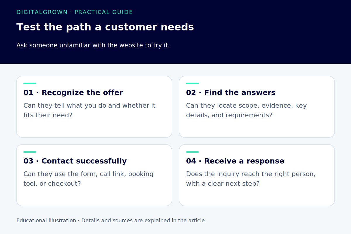
Work through the task on a phone and a desktop. Better still, ask someone unfamiliar with the website to try it while you observe. Notice where they hesitate, what they expect to be clickable, and which questions they still have.
Avoid explaining the page while they use it. If the customer needs you beside them to interpret the navigation, the website is not providing that explanation on its own. Keep a short list of observed problems rather than relying only on opinions about colors or layout.
Make the offer clear at the point of arrival
A useful opening identifies the service or product, gives the visitor enough context to know whether it suits them, and offers a sensible next step. Explain the business in words your customers use instead of a slogan that could describe almost any company.
Check that the page matches the link, advertisement, or recommendation that brought someone there. A campaign promising a specific service should not make the visitor search through an unrelated catalog to find it.
Use supporting information that helps a decision: the area served, the process, relevant examples, realistic limitations, and answers to common questions. Our guide to useful service pages shows how to organize that explanation.
Reduce the effort of finding the next page
Use navigation labels people can recognize. “Services,” a specific service name, or “Contact” often gives a clearer direction than a creative label that needs interpretation. Keep related pages connected so the visitor does not repeatedly return to the homepage.
Check link wording in the context of the page. A descriptive link should help someone understand the destination before they activate it. Google’s link guidance recommends meaningful anchor text; it is a useful reading aid as well as part of a crawlable website. [1]
Look for distractions that compete with the task. An animation, popup, or large decorative section can be attractive in isolation while making the service explanation harder to reach. Keep the elements that help the customer, and review the ones that interrupt them.
Make forms understandable and forgiving
Ask for the information you need to handle the inquiry, and explain anything that is not obvious. Visible labels should remain understandable while someone types. A placeholder that disappears is not a good substitute for a clear field label.
W3C’s form guidance recommends labels properly associated with their controls, so people and assistive technology can identify each field. Its validation guidance also explains the value of clear instructions and useful error feedback. [2] [3]
Try the form with a missing required field and a mistaken entry. Does it explain what needs fixing without clearing everything the person already typed? Then send a valid test and check the actual delivery, the confirmation, and the process used by your team.
Treat mobile use as more than a smaller layout
Check whether menus open and close reliably, important buttons are comfortable to use, and fields work with an appropriate mobile keyboard. Inspect image crops and overlays, especially anything fixed to the bottom or top of the screen.
Performance matters during use as well as arrival. A delayed response after tapping a control, an unexpected layout jump, or an embed that traps the visitor can interrupt the task even when the first screen looked fine. Our performance guide separates those different problems.
Include basic keyboard checks too. Follow the page’s interactive elements and confirm that the focused control is visible and usable. If a form, menu, or booking tool is difficult to operate, get the implementation reviewed rather than hiding the visible symptom.
Connect the website to a real response process
A completed form or a tap on a phone number is an opportunity, not a finished customer relationship. Decide who receives inquiries, how missed calls are handled, and what happens if the usual person is unavailable.
Set expectations you can meet. A useful confirmation can explain that a request has been received and what the customer should do if it is urgent. Keep those expectations consistent with your business hours and actual staffing.
Improve one thing and review the effect
Choose the clearest obstacle first. Record what you changed and compare relevant outcomes: successful submissions, useful inquiries, completed orders, or the questions customers still ask. Traffic and click counts can help diagnose the route, but they do not replace the quality of the response.
DigitalGrown’s analytics and research helps put the available numbers in context. The aim is a website that gives the right people a clear path forward, with a team ready to respond when they take it.


